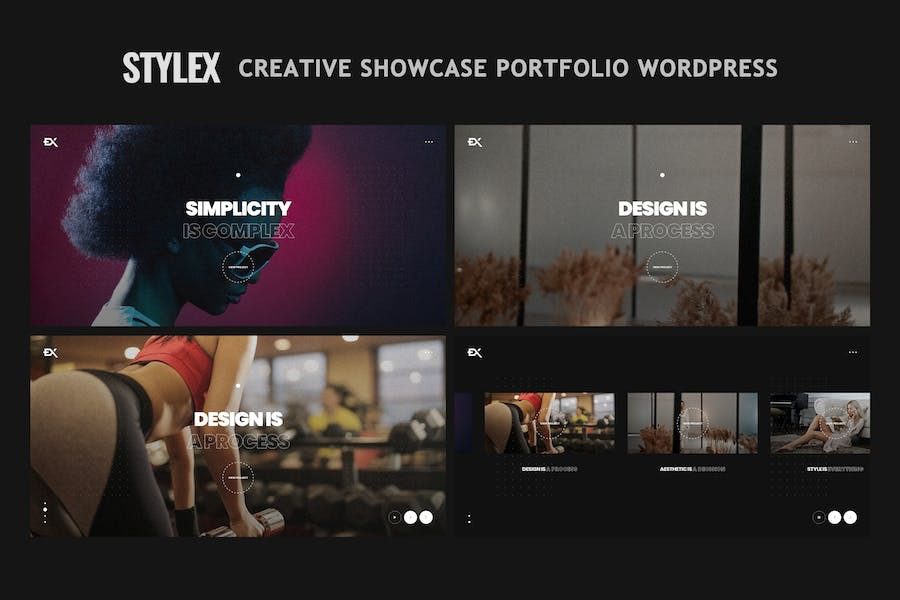
Stylex Creative Portfolio Showcase WordPress Theme In-Depth Analysis
Stylex is a full-screen creative showcase WordPress theme developed by shtheme, with version v1.7.0 offering targeted optimizations for portfolio presentation and visual impact. Its core design language is "full-screen": the hero section is anchored by full-screen video or large images with title text overlaid on top, making it ideal for photographers, designers, creative studios, and other groups that need strong visual expression. The results depend heavily on asset quality—excellent assets deliver a premium feel, while mediocre assets easily fall flat. Below we break it down across page composition, technical makeup, practical tips, and target users.
Page Composition and Layout Logic of the Stylex Theme
Stylex's page structure revolves around portfolio display, mainly including the following modules:
- Full-screen hero: Video or large image fills the viewport with a short title, leaving the visual focus entirely to the assets;
- Portfolio stream: Grouped by project or series, using "Load More" instead of traditional pagination for a more continuous browsing experience;
- About page: Creator bio, service areas, and partner brands to build trust and credibility;
- Blog module: Standard article pages, suitable for publishing creative notes and behind-the-scenes stories;
- Contact page: A Contact Form 7-based form with streamlined fields to lower the barrier to entry.
This structure lets visitors see core work within the shortest path while retaining room for content depth. For portfolio-type sites, the WordPress theme selection guide offers similar structural recommendations worth referencing.
Technical Composition and Feature Highlights
Stylex is built on the Elementor page builder paired with the Redux options framework, offering a child theme, demo data XML, load more button, dropdown menu, Retina support, Font Awesome icons, animations and motion effects, shortcode generator, custom widgets, Contact Form 7 styling, WooCommerce compatibility, HTML5/CSS3 validation, cross-browser testing, and touch swipe support. These features cover the common needs of creative showcase sites, and Elementor's visual editing lowers the barrier to page adjustments.
Five Pitfalls to Watch Out for in Practice
- Full-screen video is data-hungry. Autoplaying video on mobile consumes a lot of data; it's advisable to keep only static images on narrow screens, or use a cover image with click-to-play.
- Video encoding needs dual versions. Prepare both MP4 and WebM versions for more stable compatibility across different browsers.
- Portfolio captions must be clear. Include complete info such as work title, year, and medium—useful for exhibition submissions and client communication.
- Load More is not SEO-friendly. Infinite scrolling hinders search engines from indexing paginated content; important works should have their own standalone pages.
- Demo assets must be replaced. Swap imported sample images for your own work—showcasing your skill with someone else's work is awkward.
Additionally, the full-screen hero has limited space for copy; writing too much makes it feel crowded. A single main headline plus one subtitle line is recommended, with the subtitle explaining who you are, where you're based, and what type of work you take on. Video assets should have a backup still frame that automatically degrades to an image on poor connections, avoiding a black hero section. Beyond the portfolio stream, consider adding a "Featured" entry with only four to six of your strongest works, giving visitors a shortcut—conversion will noticeably improve.
Keep the color palette to three or fewer: one primary color, one neutral base, and one accent color. Full-screen visual themes are already visually busy; if the palette is cluttered, the focus shifts from the work to the decoration. Before launch, compress all images in batches by size, keeping landscape images within 1920 pixels wide. Export the first video frame separately as a cover image so the page shows the cover first and starts playback on click—no black-screen waiting on the hero section.
For more theme development and optimization tips, refer to the resources on bobohello.com. For the latest version information, visit the shtheme official site.
Who Is Stylex For
Stylex targets photographers and videographers, visual artists, graphic and spatial designers, creative studios, film production teams, and other groups needing portfolio showcase pages. If you pursue full-screen visual impact and are willing to invest in asset quality, this theme offers a solid starting point. The trial version is suitable for locally testing the full-screen hero and portfolio stream effects; for a live site, supporting the genuine version is recommended to receive updates and support.
Frequently Asked Questions
How do I install the Stylex theme?
In the WordPress admin under "Appearance" - "Themes" - "Add New Theme," upload the theme ZIP package, activate it, then import the demo data XML to quickly set up pages. Refer to the official documentation for detailed steps.
Which page builders does Stylex support?
Stylex is built on Elementor, with page editing primarily done through Elementor. It is also WooCommerce-compatible, allowing you to extend e-commerce functionality.
How can I optimize full-screen video on mobile?
It's recommended to disable autoplay on mobile and switch to a cover image with click-to-play, or display only a static large image. Prepare videos in both MP4 and WebM formats, and export the first frame as a cover image.
How often is the Stylex theme updated?
Update frequency varies with version iterations; refer to the official documentation or theme page announcements for details.
Is Stylex compatible with the latest version of WordPress?
The theme has passed HTML5/CSS3 validation and cross-browser testing, and is compatible with major modern browsers. For compatibility with the latest WordPress version, refer to the official documentation.